What is a Pie Chart?
A Pie Chart is a type of graph that displays data in a circular graph. The pieces of the graph are proportional to the fraction of the whole in each category.
In other words, each slice of the pie is relative to the size of that category in the group as a whole. The entire “pie” represents 100 percent of a whole, while the pie “slices” represents portions of the whole.
The pie chart is a circular graph that is used to represent data.
In this :
- Various observations of the data are represented by the sectors of the circle.
- The total angle formed at the center is 360°.
- The whole circle represents the sum of the values of all the components.
- The angle at the center corresponding to the particular observation component is given by.
- If the values of observation/components are expressed in percentage, then the central angle corresponding to a particular observation/component is given by.
How to construct a pie chart?
Steps of construction of pie chart for a given data:
- Find the central angle for each component using the formula given above.
- Draw a circle of any radius.
- Draw a horizontal radius.
- Starting with the horizontal radius, draw radii, making central angles corresponding to the values of respective components.
- Repeat the process for all the components of the given data.
- These radii divide the whole circle into various sectors.
- Now, shade the sectors with different colors to denote various components.
Thus, we obtain the required pie chart.
Here the pie chart shows the type of books preferred by the students of a class.
Given below is a pie chart showing the type of books preferred by the students of a class. Observe the chart and answer the questions given below.
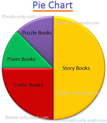
1. What fraction of students like Comic books?
Answer: The sector in the pie chart shows = 1/4
2. What fraction of students like Storybooks?
Answer: The sector in the pie chart shows = 1/2
3. Which 2 books have an equal fraction of preference?
Answer: Poem and Puzzle books.
4. What fraction of students do not like story books?
Answer: 1/2
5. Which type of book do you like to read?
Answer: Comic books
Solved Examples
1. The following table shows the expenditure in percentage incurred on the construction of a house in a city:
| Item | Brick | Cement | Steel | Labour | Miscellaneous |
|---|---|---|---|---|---|
| Expenditure(in percentage) | 15% | 20% | 10% | 25% | 30% |
Represent the above data by a pie chart.
Solution:
Total percentage = 100.
Central angle for a component = (Value of the component / 100) × 360°
Calculation of central angles
| Item | Expenditure (in percentage) | Central Angle |
|---|---|---|
| Brick | 15% | (¹⁵/₁₀₀ × 360)° = 54° |
| Cement | 20% | (²/₁₀₀ × 360)° = 72° |
| Steel | 10% | (¹/₁₀₀ × 360)° = 36° |
| Labour | 25% | (²⁵/₁₀₀ × 360)° = 90° |
| Miscellaneous | 30% | (³/₁₀₀ × 360)° = 108° |
Construction for creating the pie chart
Steps of construction:
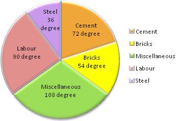
- Draw a circle of any convenient radius.
- Draw a horizontal radius of the circle.
- Draw sectors starting from the horizontal radius with central angles of 54 degrees, 72 degrees, 36 degrees, 90 degrees, and 108 degrees respectively.
- Shade the sectors differently using different colors and label them.
Thus, we obtain the required pie chart, shown in the adjoining figure.
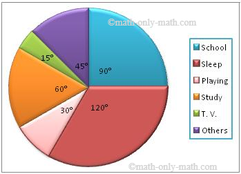
2. The following table shows the number of hours spent by a child on different events on a working day. Represent the adjoining information on a pie chart.
| Activity | No. of Hours |
| School | 6 |
| Sleep | 8 |
| Playing | 2 |
| Study | 4 |
| T. V. | 1 |
| Others | 3 |
Solution:
The central angles for various observations can be calculated as:
| Activity | No. of Hours | Measures of the central angle |
| School | 6 | (6/24 × 360)° = 90° |
| Sleep | 8 | (8/24 × 360)° = 120° |
| Playing | 2 | (2/24 × 360)° = 30° |
| Study | 4 | (4/24 × 360)° = 60° |
| T. V. | 1 | (1/24 × 360)° = 15° |
| Others | 3 | (3/24 × 360)° = 45° |
Now, we shall represent these angles within the circle as different sectors. Then we now make the pie chart:
Pie Chart Maker:
Use this link to generate Pie Chart Online – Pie Chart Maker