What is a Bar Graph?
A bar graph can be defined as a chart or a graphical representation of data, quantities or numbers using bars or strips. Bar graphs are used to compare and contrast numbers, frequencies or other measures of distinct categories of data.
![What is Bar Graph? [Definition Facts & Example]](https://cdn-skill.splashmath.com/panel-uploads/GlossaryTerm/7d3d0f48d1ec44568e169138ceb5b1ad/1547442576_Bar-graph-Example-title-scale-labels-key-grid.png)
What is a Bar Graph Used For ?
A bar graph (also known as a bar chart or bar diagram) is a visual tool. A bar graph may run horizontally or vertically. The important thing to know is that the longer the bar, the greater its value. Bar graphs consist of two axes. On a vertical bar graph, as shown above, the horizontal axis (or x-axis) shows the data categories. In this example, they are years. The vertical axis (or y-axis) is the scale. The colored bars are the data series.
Bar graphs have three key attributes:
- A bar diagram makes it easy to compare sets of data between different groups at a glance.
- The graph represents categories on one axis and a discrete value in the other. The goal is to show the relationship between the two axes.
- Bar charts can also show big changes in data over time.
Types of a Bar Graph
When presenting data visually, there are several different styles of bar graphs to consider.
Vertical Bar Graph
The most common type of bar graph is the vertical bar graph. It is very useful when presenting a series of data over time.

One disadvantage of vertical bar graphs is that they don’t leave much room at the bottom of the chart if long labels are required.
Horizontal Bar Graph
Converting the vertical data to a horizontal bar chart solves this problem. There is plenty of room for the long label along the vertical axis, as shown below.

How to Construct a Bar Graph?
Steps in construction of bar graphs/column graph:
● On a graph, draw two lines perpendicular to each other, intersecting at 0.
● The horizontal line is x-axis and vertical line is y-axis.
● Along the horizontal axis, choose the uniform width of bars and uniform gap between the bars and write the names of the data items whose values are to be marked.
● Along the vertical axis, choose a suitable scale in order to determine the heights of the bars for the given values. (Frequency is taken along y-axis).
● Calculate the heights of the bars according to the scale chosen and draw the bars.
Examples:
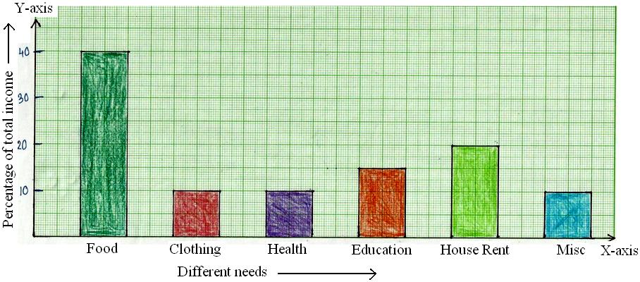
1. The percentage of total income spent under various heads by a family is given below.
| Different Heads | Food | Clothing | Health | Education | House Rent | Miscellaneous |
| % Age of Total Number |
40% | 10% | 10% | 15% | 20% | 5% |
Represent the above data in the form of bar graph.
2. 150 students of class VI have popular school subjects as given below:
| Subject | French | English | Maths | Geography | Science |
| Number of Students | 30 | 20 | 26 | 38 | 34 |
Draw the column graph/bar graph representing the above data.
Solution:
Take the subjects along x-axis, and the number of students along y-axis
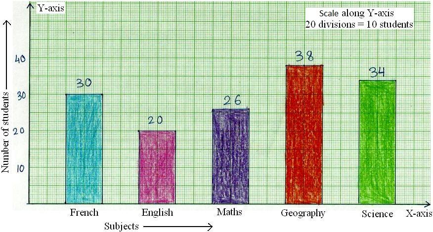
Bar graph gives the information of favorite subjects of 150 students.
3. The vehicular traffic at a busy road crossing in a particular place was recorded on a particular day from 6 am to 2 pm and the data was rounded off to the nearest tens.
| Time in Hours | 6 – 7 | 7 – 8 | 8 – 9 | 9 – 10 | 10 – 11 | 11 – 12 | 12 – 1 | 1 – 2 |
| Number of Vehicles | 100 | 450 | 1250 | 1050 | 750 | 600 | 550 | 200 |
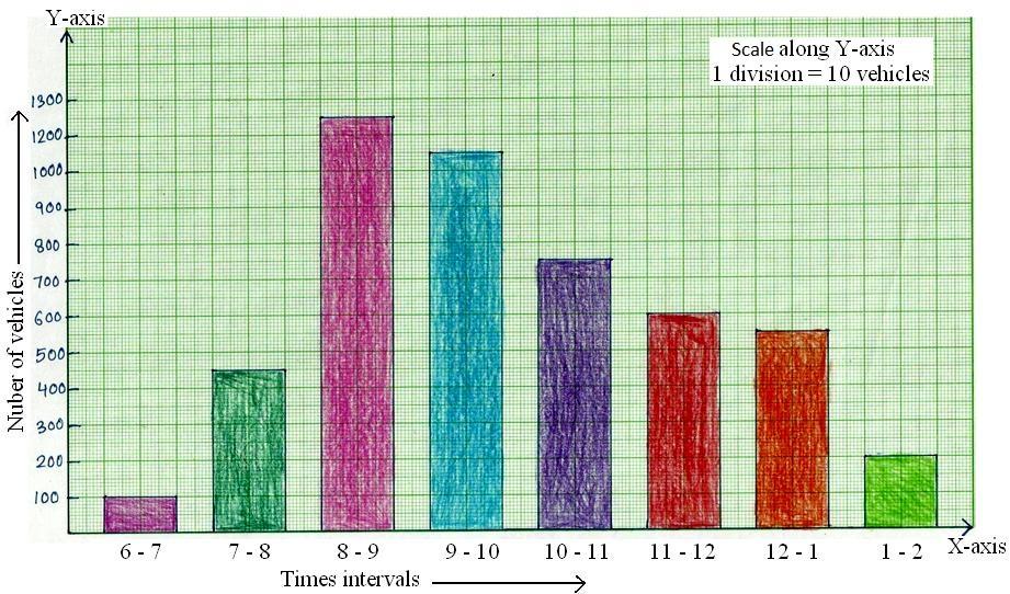
Bar graph gives the information of number of vehicles passing through the crossing during different intervals of time.