Frequency
Frequency is how often something occurs.

Example: Sam played football on:
- Saturday Morning,
- Saturday Afternoon
- Thursday Afternoon
The frequency was 2 on Saturday, 1 on Thursday and 3 for the whole week.
A frequency distribution describes the number of observations for each possible value of a variable. Frequency distributions are depicted using graphs and frequency tables.
What is a frequency distribution?
The frequency of a value is the number of times it occurs in a dataset. A frequency distribution is the pattern of frequencies of a variable. It’s the number of times each possible value of a variable occurs in a dataset.
Example: Goals
Sam’s team has scored the following numbers of goals in recent games
2, 3, 1, 2, 1, 3, 2, 3, 4, 5, 4, 2, 2, 3
Sam put the numbers in order, then added up:

- how often 1 occurs (2 times),
- how often 2 occurs (5 times), etc,
and wrote them down as a Frequency Distribution table.
From the table we can see interesting things such as
- getting 2 goals happens most often
- only once did they get 5 goals
Types of frequency distributions
There are four types of frequency distributions:
Ungrouped frequency distributions:
The number of observations of each value of a variable.
You can use this type of frequency distribution for categorical variables.
Grouped frequency distributions:
The number of observations of each class interval of a variable. Class intervals are ordered groupings of a variable’s values.
You can use this type of frequency distribution for quantitative variables.
How to make a frequency table
Frequency distributions are often displayed using frequency tables. A frequency table is an effective way to summarize or organize a dataset. It’s usually composed of two columns:
- The values or class intervals
- Their frequencies
The method for making a frequency table differs between the four types of frequency distributions. You can follow the guides below or use software such as Excel, SPSS, or R to make a frequency table.
How to make an ungrouped frequency table
Create a table with two columns and as many rows as there are values of the variable. Label the first column using the variable name and label the second column “Frequency.” Enter the values in the first column.
- For ordinal variables, the values should be ordered from smallest to largest in the table rows.
- For nominal variables, the values can be in any order in the table. You may wish to order them alphabetically or in some other logical order.
Example:
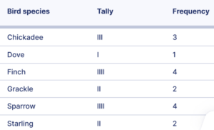
Making an ungrouped frequency table A gardener set up a bird feeder in their backyard. To help them decide how much and what type of birdseed to buy, they decide to record the bird species that visit their feeder. Over the course of one morning, the following birds visit their feeder:
Ungrouped frequency table of the frequency of bird species at a bird feeder
How to make a grouped frequency table
Divide the variable into class intervals. Below is one method to divide a variable into class intervals. Different methods will give different answers, but there’s no agreement on the best method to calculate class intervals.
- Calculate the range. Subtract the lowest value in the dataset from the highest.
- Decide the class interval width. There are no firm rules on how to choose the width, but the following formula is a rule of thumb:

You can round this value to a whole number or a number that’s convenient to add (such as a multiple of 10).
- Calculate the class intervals. Each interval is defined by a lower limit and upper limit. Observations in a class interval are greater than or equal to the lower limit and less than the upper limit:

The lower limit of the first interval is the lowest value in the dataset. Add the class interval width to find the upper limit of the first interval and the lower limit of the second variable. Keep adding the interval width to calculate more class intervals until you exceed the highest value.
Create a table with two columns and as many rows as there are class intervals. Label the first column using the variable name and label the second column “Frequency.” Enter the class intervals in the first column.
Count the frequencies. The frequencies are the number of observations in each class interval. You can count by tallying if you find it helpful. Enter the frequencies in the second column of the table beside their corresponding class intervals.
Example:
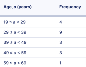
Grouped frequency distribution A sociologist conducted a survey of 20 adults. She wants to report the frequency distribution of the ages of the survey respondents. The respondents were the following ages in years:
52, 34, 32, 29, 63, 40, 46, 54, 36, 36, 24, 19, 45, 20, 28, 29, 38, 33, 49, 37
Solution:
range = highest – lower
range = 63 – 19
range = 44

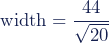
width = 9.84
Round the class interval width to 10.
The class intervals are 19 ≤ a < 29, 29 ≤ a < 39, 39 ≤ a < 49, 49 ≤ a < 59, and 59 ≤ a < 69.
Grouped frequency table of the ages of survey participants