What is Histogram?
A histogram is the graphical representation of data where data is grouped into continuous number ranges and each range corresponds to a vertical bar.
- The horizontal axis displays the number range.
- The vertical axis (frequency) represents the amount of data that is present in each range.
The number ranges depend upon the data that is being used.
Example: Height of Orange Trees
You measure the height of every tree in the orchard in centimeters (cm)
The heights vary from 100 cm to 340 cm
You decide to put the results into groups of 50 cm:
- The 100 to just below 150 cm range,
- The 150 to just below 200 cm range,
- etc…
So a tree that is 260 cm tall is added to the “250-300” range.
And here is the result:

You can see (for example) that there are 30 trees from 150 cm to just below 200 cm tall.
How to Make a Histogram?
The process of making a histogram using the given data is described below:
- Step 1: Choose a suitable scale to represent weights on the horizontal axis.
- Step 2: Choose a suitable scale to represent the frequencies on the vertical axis.
- Step 3: Then draw the bars corresponding to each of the given weights using their frequencies.
Histogram for a Grouped Data
A histogram is a two-dimensional graphical depiction of a continuous frequency distribution.
The bars in a histogram are always put side by side, with no gaps between them. That is, rectangles are built on the distribution’s class intervals in histograms. The frequencies are proportional to the rectangle areas.
Let us now examine the procedures involved in creating a histogram for grouped data.
- If the data is in a discontinuous form, represent it in a continuous form.
- On a uniform scale, mark the class intervals along the x-axis.
- On a consistent scale, mark the frequencies along the y-axis.
- Create rectangles with class intervals as the bases and frequencies as the heights.
Example: The following data represents the results of a test taken by a group of students:

Histogram for Ungrouped Data
The histogram is created by plotting the class boundaries (not class limits) on the x-axis and the corresponding frequencies on the y-axis from the grouped data. Before constructing a histogram with ungrouped data, we must first create a grouped frequency distribution.
Bar graphs are often used for discrete and categorical data. However, in rare cases where an approximation is required, a histogram may be generated. The steps for creating a histogram for ungrouped data are as follows:
- Mark the possible values on x-axis.
- Mark the frequencies along the y-axis.
- Draw a rectangle centred on each value, with equal width on each side and a margin of 0.5 on either side.
Example: Use the data from the first example that displays the ages of the lottery winners to construct a histogram. The data is shown again below. What percentage of the winners were 50 years of age or older?
Use the data as it is represented in the distribution table to construct the histogram.

Examples:
We will discuss here some of the problems on histogram.
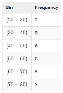
1. The histogram for a frequency distribution is given below.
Answer the following.
(i) What is the frequency of the class interval 15 – 20?
(ii) What is the class intervals having the greatest frequency?
(iii) What is the cumulative frequency of the class interval 25 – 30?
(iv) Construct a short frequency table of the distribution.
Solution:
(i) 25
(ii) 20 – 25
(iii) 90
(iv)
|
Class Interval 10 – 15 15 – 20 20 – 25 25 – 30 30 – 35 35 – 40 |
Frequency 20 25 30 15 10 5 |
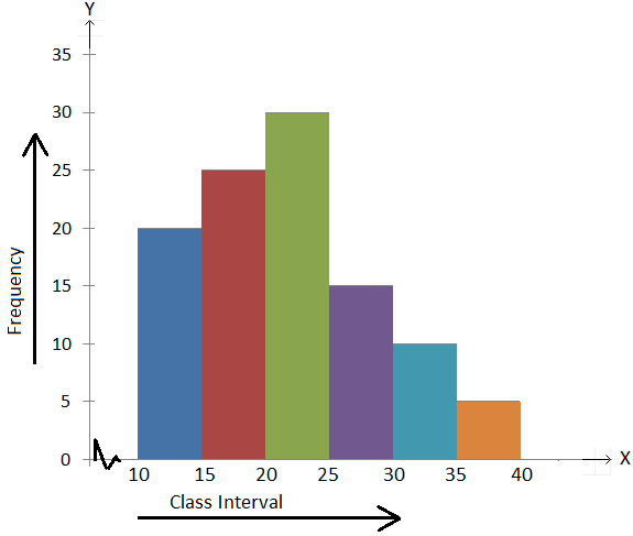
2. The histogram for a frequency distribution is as shown below.
Answer the following.
(i) Find the class intervals having the greatest and the least frequencies.
(ii) Find the class interval whose frequency is 40.
(iii) What is the frequency of the class interval 30 – 40?
(iv) What is the cumulative frequency of the class interval 30 – 40?
(v) Construct the frequency table of the distribution.
Solution:
(i) The class interval 10 – 20 has the greatest frequency as the rectangle corresponding to the interval has the greatest area, the height being the greatest.
(ii) 20 – 30
(iii) 30
(iv) 50 + 40 + 30 = 120
(v)
Class Interval Frequency
10- 20 50
20 – 30 40
30 – 40 30
40 – 50 40
When to Use Histogram?
The histogram graph is used under certain conditions. They are:
- The data should be numerical.
- A histogram is used to check the shape of the data distribution.
- Used to check whether the process changes from one period to another.
- Used to determine whether the output is different when it involves two or more processes.
- Used to analyze whether the given process meets the customer requirements.
Difference Between Bar Graph and Histogram
A histogram is one of the most commonly used graphs to show the frequency distribution. As we know that the frequency distribution defines how often each different value occurs in the data set. The histogram looks more similar to the bar graph, but there is a difference between them. The list of differences between the bar graph and the histogram is given below:
| Histogram | Bar Graph |
| It is a two-dimensional figure | It is a one-dimensional figure |
| The frequency is shown by the area of each rectangle | The height shows the frequency and the width has no significance. |
| It shows rectangles touching each other | It consists of rectangles separated from each other with equal spaces. |
The above differences can be observed from the below figures:
